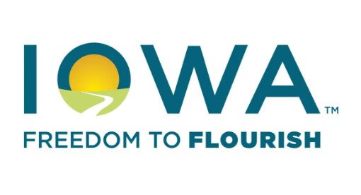
Gov. Reynolds Unveils New Logo for State of Iowa

(Radio Iowa) Governor Kim Reynolds has unveiled a new logo and slogan for the state of Iowa.
Governor Reynolds calls it a “brand mark.” It features IOWA in big blue capital letters. The O is filled in with yellow to depict the sun, green to signify the landscape and a white winding road. Three words — FREEDOM TO FLOURISH — are printed below.
“The road to the horizon in the letter O is a familiar scene in Iowa and one that represents a journey to opportunity,” Reynolds says. “The tag line, ‘FREEDOM TO FLOURISH,’ communicates a motivating message that in Iowa, you can reach your potential.” Last fall, the state hired FleishmanHillard, a public relations agency based in Kansas City, to work on a unified state brand.
“It included state agencies, directors, communications teams from across state government who really helped inform the development of the unified brand strategy for our state,” Reynolds said, “and one that will not only attract visitors, but opportunity seekers of all types.” Some state agencies began using this new logo yesterday (Tuesday) and others will as old stationary is used up and new letterhead is ordered. “We conducted research that included Iowans and other neighboring states and beyond to ensure that the logo and the tag line would connect with people in the right way,” Reynolds said, “and it did.” The new logo and “FREEDOM TO FLOURISH” slogan soon will be seen on road signs that welcome motorists as they drive into Iowa from neighboring states. The current design for signs at 68 different locations along Iowa’s border crossings was unveiled at the 1999 Iowa State Fair by Governor Tom Vilsack. They say: “The People of Iowa Welcome You” at the top. There’ a sunrise and a green swoosh to symbolize the horizon in the middle along with the words: “Iowa” and “Fields of Opportunities.” In 1970, Governor Robert Ray unveiled the “Iowa: A Place to Grow” slogan along with a clover leaf symbol that Ray said depicted growth in all directions.


